A service website’s main menu should help a prospect find the relevant service, assess whether the business is suitable and take the next step. Give prominent space to destinations that support those tasks. Keep specialist resources and secondary information available elsewhere instead of making every page a top-level item.
The right structure depends on your actual offer. A consultancy with two services needs a different menu from a business with several distinct departments. Use the decisions below to prepare a menu brief before commissioning design changes.
Start with visitor tasks, not your company chart
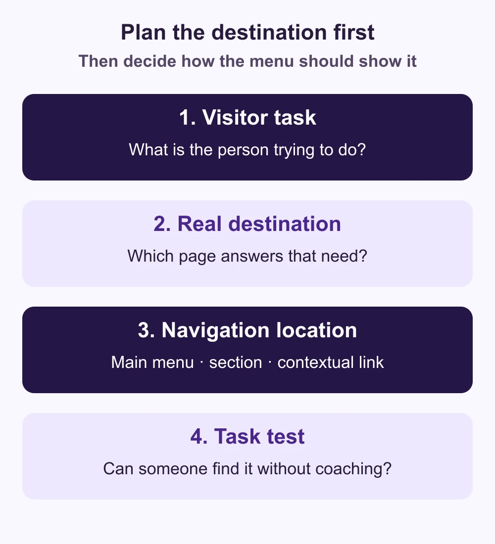
Write down three requests a new visitor should be able to resolve: finding a specific service, checking relevant experience and asking about a project. Then assign a real destination to each task. A label is not useful if the page behind it cannot answer the question.
For example, a hypothetical building consultancy might serve owners needing surveys, project management or maintenance advice. Those are recognizable choices. An internal department name such as “Integrated Excellence” tells a newcomer much less. These examples are planning suggestions, not findings from a GoSocial client study.
Decide where each destination belongs
Use this table to sort proposed items. It is a decision aid, not a fixed menu template or a universal limit on the number of links.
| Destination | Consider for the main menu when… | Another useful location |
|---|---|---|
| Individual service | It is a distinct offer that prospects need to recognize immediately. | A clear Services overview and relevant page links. |
| Work or case studies | Examples help buyers evaluate your suitability. | Contextual evidence beside the corresponding service. |
| About the business | Team, approach or credentials matter to the buying decision. | A company section with supporting pages. |
| Guides or blog | Useful guidance is an established part of the customer journey. | A resource section and related-article links. |
| Contact or project enquiry | The destination provides an appropriate next step. | A relevant call to action on service pages too. |
If you group services under one item, make the overview useful: explain the differences and link to each service. Do not create an empty intermediary solely to shorten the header. Conversely, listing every minor variation separately can make the main choices harder to compare.
Write labels that match the destination
Use the words a customer would use to distinguish your services. A menu item called “Request a quote” should lead to a quote enquiry, not a newsletter form. If a consultation is the realistic next step, say so rather than implying an instant price.
Google’s link guidance recommends crawlable links and concise, descriptive anchor text. Ask your implementer to verify that navigation destinations use real links with valid addresses. Repeating keywords throughout the menu is not a substitute for useful service pages.
Check mobile and translated menus as separate experiences
Keep visible items consistent in wording, order and destination across screen sizes, as described in W3C’s menu-structure guidance. A collapsed phone menu can still offer the same understandable choices. Check that the contact path remains easy to recognize when the menu is open.
For dropdowns, verify keyboard operation and an alternative route to their contents; W3C’s fly-out menu tutorial explains these concerns. Test the actual interaction rather than assuming that a dropdown looks accessible because it opens on hover.
Adapt labels naturally in each language. Check longer French labels and Arabic right-to-left presentation on a real narrow screen. A language switch should take the reader to the corresponding translated page when available, rather than unexpectedly restarting the journey at the homepage.
Run a small task test before changing the whole site
Ask someone unfamiliar with your structure where they would look for a named service, evidence of relevant work and a way to enquire. Do not coach them through the labels. Note their first choice, any hesitation and whether the destination answers the task. This is a practical diagnostic, not a statistically conclusive conversion experiment.
If the labels work but the destination disappoints, improve that page. If several people interpret the same label differently, revise the grouping or wording and retest. Our website brief guide helps record the proposed pages and responsibilities; the redesign decision guide helps separate a navigation fix from a wider rebuild.
For a scoped recommendation, send GoSocial your current menu and the tasks visitors need to complete. We can review the structure alongside the service pages, including website projects for the UK and US. A clearer menu supports the journey; it does not guarantee enquiries or rankings.